Friday, December 17, 2010

Philippines new money design

Its been a while since our country think about getting a new face for our money, and when first looked at i was astounded, it looks cooler and more presentable than ever before, and it kinda looks like a european dollar.

All the colors where still retained so we shouldn't get confused by the new looks and presentation of the money heres a sample of the new look of a 20 peso bill: Take note that the black numbers are not included,


Bangko Sentral ng Pilipinas on Thursday unveiled the bank notes’ new designs, as well as its new security features.
Amando Tetangco, Bangko Sentral ng Pilipinas Governor said the new currencies took three years to complete, from conceptualization and printing, now thats some serious planning and conceptualizing I'd really hope to get a job like that cause i usually get to do the conceptualizing and designing for just a few hours because of the deadline.
He said the new bills will make it “difficult for counterfeiters to copy while easier for people to determine counterfeits.”
Tetangco said the new bank notes “combine new and familiar elements.”
“We retained colors to make sure people don’t get confused,” he added.
The bills will be in circulation this December while the old bank notes will still be accepted within the next three years. In that case we should be seeing the new money really really soon. heres another image:
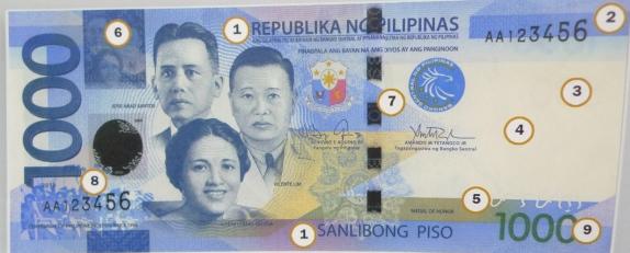

Money features
The new bills continue to honor great Filipinos like former presidents Manuel Quezon, Sergio Osmena, Manuel Roxas, and Diosdado Macapagal. Former senator Ninoy Aquino, and war heroes Josefa Llanes Escoda, Vicente Lim, and Jose Abad Santos are also featured on the bills. the faces looked somewhat digitally created, and looked quite really photoshopped but so far it still looked good, but for the faces i'd still prefer the old ones.
However, the P500 bill now features former President Corazon Aquino, whose photo is placed beside her husband, Ninoy. It also depicts a smiling Ninoy, a far cry from his forlorn image in the current P500 bill. heres the image:


“The decision to honor Cory Aquino in the P500 note was announced in the week that she passed away, long before their son ran for president,” said Tetangco. well what do we expect?, and take a look at their smiles, its like (yeah we rule! and our son was president too! fck ya'll haters!) hahahahaha! lols!
The P500 bill also makes history by having both parents with the signature of their son, President Benigno “Noynoy” Aquino, for the win bitches! kulang nalang si kris aquino hahaha!.
Aquino said it makes him happy “as a son and as a Filipino” to have his parents on the same bank note where his signature appears.
“It is a testament to what they sacrificed for our people, and a testament to their love for our country,” said Aquino.


All the bills continue to have these security features: embossed prints, serial numbers, security fibers and threads, and watermark. But new security features include the word “Pilipino” written in “Baybayin,” a pre-Spanish writing system, and the Republic of the Philippines seal. whew, and i suggest they put an encryption security feature with binary numbers on it, or maybe a nanogerm that reacts to a detector when scanned lols!.


The back of the P20 bill shows the Banaue Rice Terraces and an animal, Palm Civet or ‘Alamid’ in local language.
The now darker red P50 bill meanwhile shows Taal Lake and Maliputo, a fish that thrives only in the waters of the lake.
The back of the almost purple P100 bill shows ‘perfect cone’ Mayon Volcano and a Butanding, a whale shark that is a main attraction in Sorsogon.
The almost-green P200 bill shows Bohol Chocolate Hills and the world’s smallest primate found in the Philippines, the Tarsier.
Former president Gloria Macapagal-Arroyo’s photo taking oath is now in front of the P200 bill but is almost not visible well what noy noy wants noy noy gets bitch! hahaha!.
The P1000 bill features the Tubbataha Reefs Natural Park and a South Sea Pearl.


well so far i think noy-noy has done something worth remembering, and try to look at that guys face, looks like a pile of shit but by the hearts of many pinoys' this person is more like gold dug on a mile of sand, yeah more like obama in america.


Wednesday, December 15, 2010

Project days

Ive been currently busy or a while or should i say occupied by some projects lately, and that often made me feel productive as ever, although it stresses me a lot and i get to sit a lot on the chair for hours on the day and night well i can't deny it, i need money, money is quite important in my day to day gimmicks and activities and despite the fact that im a graduate student now well that shows how badly i want to be productive these days. First project i got was a header and pilot advertisement slider design on ms. Sharon Cullens new upcoming and updated website, ive designed 5 of it, and its very well appreciated by the client, heres some sample:


The color scheme the images and the texts match up to what i expected it to be, it looked nice and great to look at, i've also enhanced the image of sharon for it to stand out on the background, adjusted some o the colors and added typography into it to turn it into an advertisement slider which practically promote sharons profession, i got paid for almost a hundred dollars for it yay! thats hours well spent! thanks to my very sweet and charming adviser and mentor Ms. Irish Racelis for you can check her blog here: http://miss-honeul.net/

Im happy to have projects flowing this holiday season, now i have the money to buy stuff for me again this christmas and i won't have to beg my mom for it! yeah!, next project i did was the whole new furbish up mockdraft website, they want the whole website updated via their requests not based on my own idea so i have to come up with ideas which has non changeable instructions upon which i should not violate,  otherwise im dead! hehe, this took me a half a day of my lifetime to create, conceptualize all the possible stuff on it eg: the fonts the typography etc etc, and choose the color scheme. but so far ive now created two pilot pages, ones on the top and the 2nd layout is on below:


For the second layout i chose a black scheme, which is not totally black but is actually a gradient made from black colors, and added up some white transparency thingy to it to spice it up a bit, changed the font to calibri and added up some minor changes, which took me again hours of conceptualize and creative thinking., and for me the second design mainly is my pick for the design and luckily they also liked it. but the pages are not finished yet, i still have some pages to create today and im going to finish it later tonight. I just hope the clients will like it. what a very productive season.

Saturday, December 11, 2010

THE NEW FACEBOOK PROFILE THEME!!SUCKS!!!

Ive been pissed of by the new profile theme facebook has, and it is by far the most annoying most irritating theme of facebook ever! I mean seriously what the hell were they thinking!!!. the facebook theme totally sucks ass and I mean bigtime!!!


the first thing that irritated the shit out of me was the new news feed, seriously zuckerberg why the hell would you hide the whats on your mind option??, it just disappeared like shit and the first time it changed i never even saw it until i saw this very tiny status option!!!!When i clicked it, then it appears like shit pooped out on a rats ass!! seriously WHAT THE HELL WHERE THEY THINKING!!!!! but wait! theres more!

Take a look at the fonts of the wall post now, i know it looked much more neat and clean, but it looks smaller than the previous font! and by the look and feel, the news feed just feels like regular license agreement text that looks irritating and boring to even read! it felt so out of focus that we tend to never care about it specially if its flooded with other texts! unlike the old typography font they used which makes people interested to read specially when its on BOLD format! What the heLL!!


Next stop that just pisses me off is the profile landing page, yeah look at that, that just looks like a pile of unordered piece of shit.
- first thing is, where's the pilot post msg? the thing USUALLY PEOPLE READ WHEN THEY LAND IN YOUR PAGE!!? ITS THE TOOL FOR COMMUNICATION! THE MAIN TOOL FOR FRIENDS TO SEE WHAT YOU FEEL OR WHAT YOUR DOING IN A FREAKIN INSTANT!! THE MSG BOX THAT TELLS WHAT YOU WANT FOR PEOPLE TO SEE IMMEDIATELY!!!

ITS THE MAIN REASON WHY I DON't USE TWITTER!! cause its like a tweet box in facebook!!! why the hell remove it!!!? What the hell were they thinking!?. Is there any explanation to their "CREATIVE" IDEA?! Right Now the wallpost message looks just like the news reel shit.. OHHH your Lord..

- And also the the WHATS ON YOUR MIND thing was Gone too!, instead what they did was replaced it with basic automated shitty information about you that people will read all over and over again when they first landed on your wall, it also so just means that when you don't put in any proper information on your information tab, your Fucked UP! and for first impressions, it will look like your a first time boring facebook user and a boring person WTF!! AND WHO THE FCK CARES ABOUT THE LANGUAGE YOU KNOW??!!

- The last thing that pisses me off about the top header page is the Dreaded tag pictures!, What the Hell were they thinking?! Whats the point of posting your tagged pictures on top?!! And Some tag pictures just pisses people off because its not related or it just makes no FREAKIN SENSE!!! AND IN FACT ONE OF MY TAGGED IMAGES RIGHT NOW IS A GODDAMN SHOE SO THEY ALL SEE THE SHOE ON MY LANDING PAGE!!!ARRRRG!!!


Our next pissed of stop is on the left side o the landing page, Take a look at the profile picture alignment, it sticks on the left border line of the page! you think that looked creative zucker?!!! well ask 20 thousand creative web people who's also pissed of by it, and you will see!!.

And take a look at the friend and relationship tab, It generates random friends every reload and i don't get the point upon posting it there!!! who cares about randomly generated friends if people can just click the tab to see it if they're interested!!

The freedom wall on the left side is also gone! Holyy COW!!!, Now I can't even post any recent stuff i wanted my friends to show! such as my blogs, accomplishments, recent stuffs or Quotes Or links!! DAMMIT! ITS YOUR MAIN PILOT PAGE THAT PEOPLE WOULD CARE TO LOOK AT IN JUST A MINUTE! TO SHOW THINGS YOU DO OR UPDATES, WHO THE HELL WOULD GIVE A DAMN ABOUT RANDOMLY GENERATED FRIENDS!. On the old facebook profile you can customize it by the way you want it But now, NO!!! TO HELL YOU USERS!! THE NEW THEME DON't GIVE A DAMN!


And By Far THE most WORST THING THAT PISSES ME OFF IS, YOU CAN'T TURN IT BACK TO ITS DEFAULT THEME!!! O YES!!! THATS THE CREAM OF THE CRAP!!!.

Facebook gave users the chance or privilege to CHOOSE an option!!, The HECK?! CHOOSE?! WHEN you click the change profile option! It HAS NO OPTION TO TURN THE PAGE BACK TO ITS OLD COOL CREATIVE THEME!! Now thats a WINNER!

Overall it just pisses me off like hell, it looks generic, Im pissed off by the typography, the landing page and everything new to it specially the left panel bar, its my own opinion about it, and instead of just doing nothing and acting like a stereotype generic slave and wait for it to change ill write what I feel Just Like thousands of people that's pissed off by it..